Lower back script tattoos in this collection run from a single tucked-away word like "Blessed" to larger pieces that need more time in the chair.
One piece on this list pairs "All the rage back home" with the comma after "home," which changes the tone from boastful to wry; without that punctuation, the whole meaning shifts.
1. Adore Me Cursive Lettering Tattoo

"Adore Me" sits low and centered, the kind of phrase that reads differently depending on who is looking. Two dermal piercings frame this one, which I would skip; the skin there flexes too much for surface anchors to last.
A flowing cursive with flourishes at each end keeps the eye moving across the words rather than stopping. The artist needs a steady hand for the thin upstrokes; any wobble in the loops shows immediately on this scale.
Ask to see healed photos of their script work, not just fresh ones. Black ink holds here, but the lower back sees sun, waistbands, and lotion; that combination fades the fine lines faster than a rib or thigh placement.

24PCS Unique Henna Stencil Pack – This complete henna tattoo kit accessory set includes 24 sheets of reusable mehndi stencils (6.89" x 3.34"). Featuring exclusive designs like long arm bands, moon motifs, vine flowers, and large floral templates, it is ideal for creating DIY temporary skin art on wrists, arms, back, and full body.
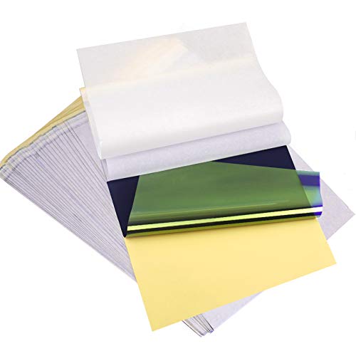
ADVANCED MATERIAL: Tattoo transfer paper is made with the high quality dyes and stencil paper. Transfer marks are very clear, clean and smooth. Tattoo transfer paper kit come with 35 sheets. Great for tattooing, trace and transfer images onto the body.<br>

Clean, Flawless Transfers: Your artwork will look so clean once transferred to the skin with the Stencil Stuff gel! Gentle on the skin, Stencil Stuff transfer solution helps you achieve clear and sharp tattoo stencil transfers every time!
2. Blessed Cursive Text Tattoo
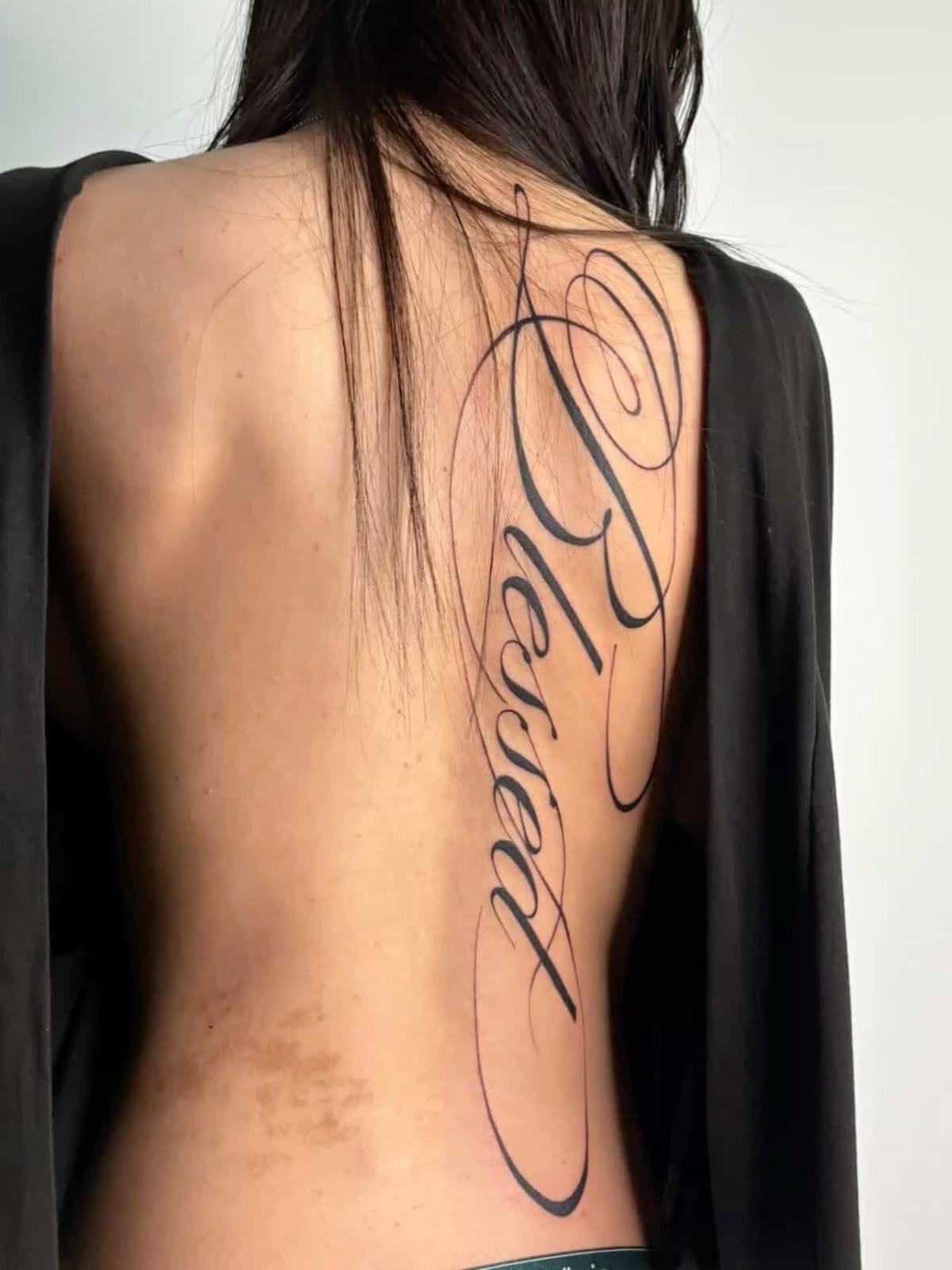
Vertical "Blessed" running the spine reads as devotion; horizontal across the lower back reads as reminder. Vertical placement keeps the text readable when you turn, and horizontal works too if you want it wider across the hips.
Fine line weight keeps it from shouting. The flourishes matter more than the word itself; without them, a single word this short can look like a label rather than a piece.
I would check that the ascender on the B and the tail on the d balance each other, or the whole thing tilts visually.
Horizontal placement sits where a waistband or swimsuit line might cut it; vertical stays clear of most clothing but costs more sessions since the spine is tender and the artist works slower.
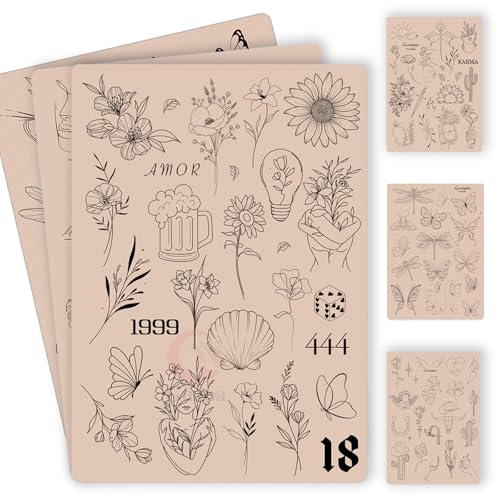
100+ Pre-Printed Designs – Features a wide variety of fine line and tiny tattoo stencils to enhance detailing skills.

Precision Transfers & Long Lasting: Tattoo stencil paper delivers vibrant, high-definition transfers even for intricate designs. Creates crisp, dark lines that transfer cleanly to skin (clearly on different skin tones) which are easy to follow during tattooing. The carbon layer made from high-quality dyes ensures sharp outlines without smudging or fading and maintains crisp lines visibility throughout long tattoo sessions, so you can focus on creating art instead of re-drawing lines

Double Sided Tattoo Practice Skin: easy wipe, 2 sides designed fine line tattoo practice skins feature over 20 different stencil designs.
3. All the Rage Back Home Fine Line Cursive Tattoo
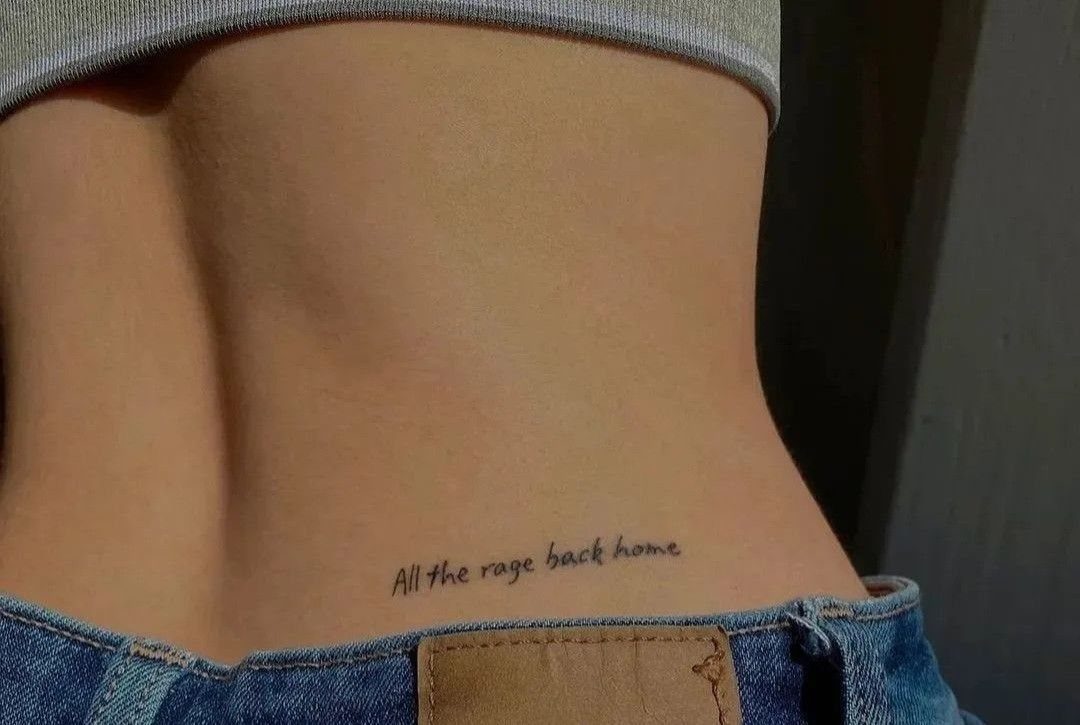
"All the rage back home" is long for a lower back tattoo, which is exactly why it works; the phrase needs the full width to breathe. Fine line keeps the density from turning into a black bar across the skin.
This is a lyric from Interpol, if that matters to you. The period after "home" is part of the punctuation, and I would insist the artist include it; without, the tone shifts from wry to boastful.
Jeans sit right at the bottom edge, so placement needs measuring with your own waistband in place, not pulled down for the stencil.
Horizontal script here competes with the natural dimples and curve of the lower back; a phrase this long follows that curve better than a single word would.
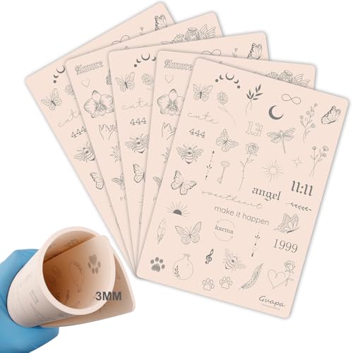
3MM Tiny Tattoo Practice skin Made from high-quality materials, it is closely mimic the texture and feel of real human skin. This gives you a realistic experience, allowing you to refine your skills before working on actual clients

📦 [10Pcs Individually Sealed] 10 sheets of premium tattoo practice skins (8"x6" / 1.0mm thick), each vacuum-sealed for hygiene. Double-sided blank fake skin maximizes usage – wipe & reuse for multiple techniques.

GUIDED DESIGNS FOR FOCUSED PRACTICE: Five thick patterned tattoo skin give beginners clear visual references for outlining, curves, corners and detail work. Tiger, dragon, skull, rose and lotus artwork helps vary each session instead of repeating one simple motif
4. MADE IN HEAVEN Sans-serif Font Tattoo

All caps sans-serif is the choice when you want the words read before the font noticed. This phrase tucks small, just above the waistband, the kind of placement that shows only when you want it to.
Sans-serif ages better than thin cursive; there are no hairlines to blur.
The spacing between letters matters more than the letters themselves. I would ask the artist to stencil it, stand up, sit down, and bend forward before committing; all-caps blocks can seem to spread or compress as the skin moves.
This font reads as label or brand, which suits some temperaments and grates on others. Know which you are.
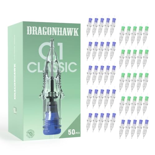
WHAT YOU GET: 50 tattoo needle cartridges, 10 of each configuration - 1003RL, 1005RL and 1007RL bugpin round liners at 0.30mm plus 1205RS and 1207RS round shaders at 0.35mm. One box covers the full small scale workflow, moving from crisp outlines to soft shading without ordering separate liner and shader boxes. A practical resupply for working artists and a focused set for artists building fine line skills.

Package: 50pcs mixed tattoo cartridge needles, includes 10pcs each of 1203RL, 1205RL, 1207RL, 1209RL, 1211RL.

Dragonhawk Tattoo Needles: High-quality tattoo needles, manufactured under the trusted Dragonhawk brand, are perfect for all-purpose work. With a polished, long taper design, these needles ensure reliable performance and excellent control.
5. Gothic Script Lower Back Tattoo
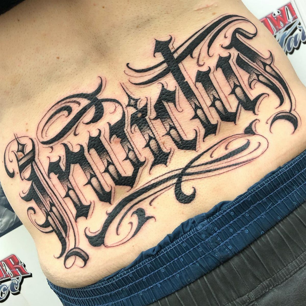
"Invictus" in gothic script with flourishes and shading is a statement piece, not a tucked-away phrase. The lower back is one of the few places with enough flat real estate for lettering this ornate at a readable size.
Gothic script demands an artist who specializes in it; the sharp serifs and consistent black fill are unforgiving.
Shading around the edges adds depth but doubles the session time and the healing attention. This style reads masculine by default, though the flourishes can soften it.
I would budget for a touch-up; the heavy black heals with some fall-out, and the flourishes lose their crispness first. Keeping this in black is the right call; gothic script with color tends toward Halloween.

Safe and Healthy: Our tattoo transfer gel meets strict safety and non-toxic material standards, non-irritating to the skin and vegan-friendly. Maintains client comfort while achieving clear tattoo stencil transfers.

🛡️ SAFE AND GENTLE FORMULA - Our tattoo goo is made from skin-friendly, plant-based ingredients that are non-toxic and non-irritating, ensuring gentle use on all skin types during stencil transfer.
Clean, Flawless Transfers: Your artwork will look so clean once transferred to the skin with the Stencil Stuff gel! Gentle on the skin, Stencil Stuff transfer solution helps you achieve clear and sharp tattoo stencil transfers every time!
6. Gothic Script Tattoo with Roses
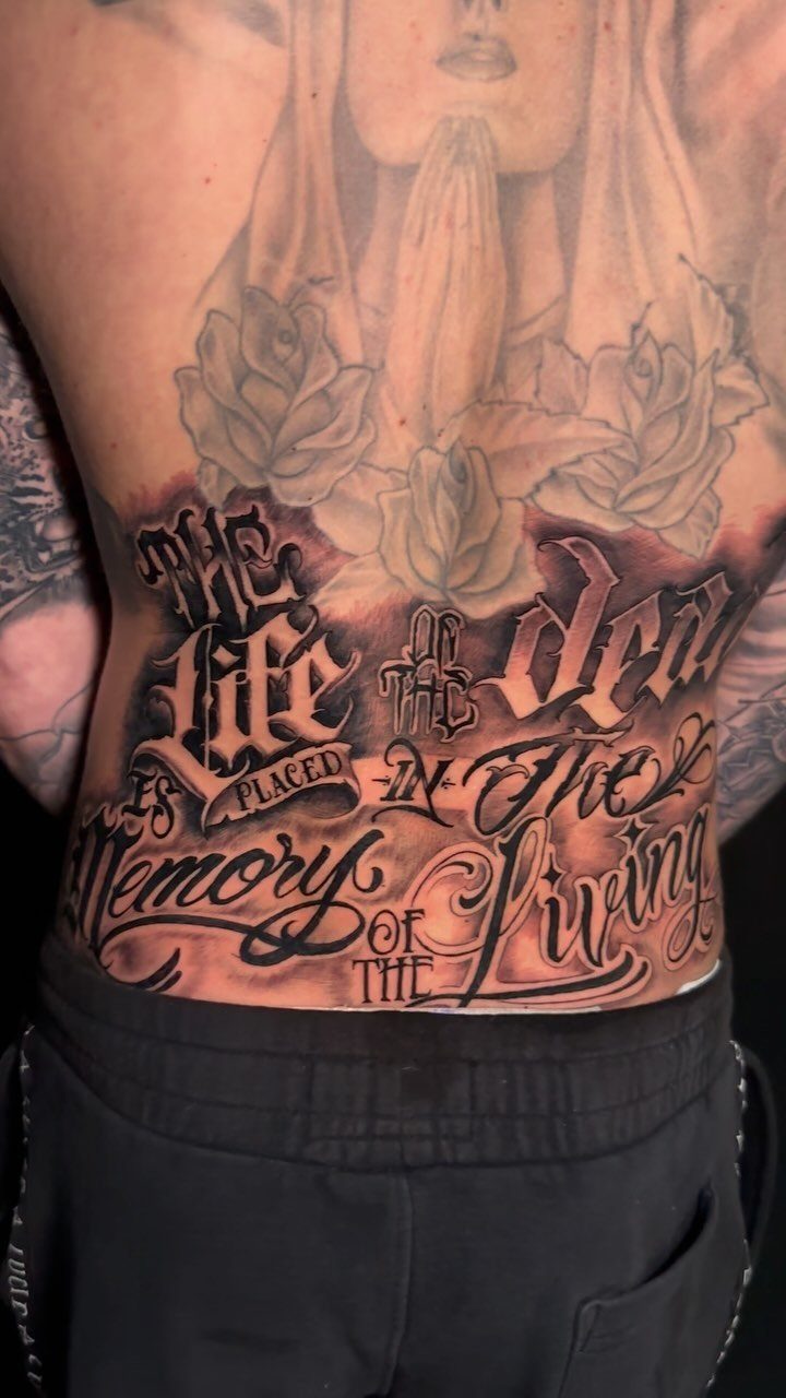
Roses and a praying figure frame gothic script here, which turns a word or phrase into a tableau. The lower back becomes a canvas rather than a caption.
This is the most commitment on the list. The script must integrate with the imagery, not float above it; the artist should design both together, not add flowers around existing lettering.
Black-and-grey shading on roses takes skill to keep them readable as roses rather than dark blobs once they settle in.
This scale of piece is more common on male backs, though the placement works for anyone with the tolerance for long sessions.
I would plan for multiple sittings; trying to do this in one day is how you get a half-finished piece and a body in shock.

Explore your artistic side with our 'Henna Tattoo Lower Back Art Book', a treasure chest of unique, handmade high-resolution tattoo designs crafted by professional artists

Warm Tips: The tattoo transfer paper need to work with transfer medias.You will need to purchase the stencil ointment separately. Apply the design made on the master paper. Please pay attention to press the back side of the pattern to the skin for at least 3 seconds

Product Kits: You will receive 12 A4 sheets featuring 142 unique henna tattoo stencils patterns including butterflies, flowers, words, symbols, totems and egyptian designs. Our versatile temporary tattoos adult with stencils collection offers something for every taste with its wide variety of artistic models.
7. Amore Cursive Script Tattoo
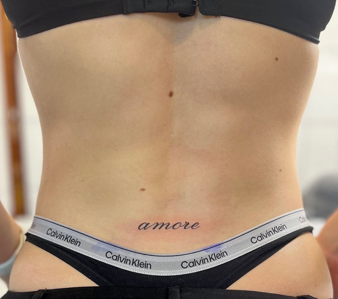
"Amore" sits small and centered, the Italian word for love carrying more weight than the 3 letters suggest. A single word this short needs the flourishes at each end to keep it from looking like a stamp.
Fine-line cursive here is readable at a glance, which matters for a word most people will not understand without context.
The placement just above the waistband puts it in the line of fire for elastic, denim, and sun; black ink holds better than color would, but I would still plan for a touch-up in a few years.
Ask the artist to show you the stencil with your own waistband in place; too high and it hides, too low and it disappears under clothing.


Crystal Clear Transfer & Stable Stencil Effect : Our KVM transparent tattoo stencil film delivers sharp, clean printed lines. The pattern transfers perfectly onto skin, not easy to smudge or wipe off after application. It works great for intricate mandalas, skulls, portraits and line art.

Tiny Tattoo Practice Skin: the double-sided, easy-wipe, fine-line tattoo practice skins feature over 80 different stencil designs on the front and back of the skin.
8. Red Cursive Script Tattoo
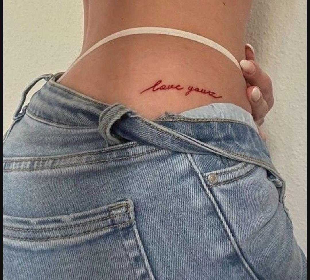
Red ink on script is a choice that reads as warning or romance depending on the viewer. "Love yourz" keeps the informal spelling, which I would either commit to fully or correct to standard; half-measures look like mistakes.
Red fades faster than black, especially on the lower back where sun and friction both hit.
The thin lines here need an artist with a light hand; red can blow out or disappear if the needle goes too deep or too shallow.
Healed photos tell a different story than fresh ink, especially with red pigment that settles lighter than it goes in.
Placement needs measuring with your usual underwear, not whatever you wore to the shop; the tattoo sits in that narrow strip the waistband leaves visible.

Premium Quality 1.5mm Silicone Material – Crafted from premium 1.5mm thick silicone, this tattoo skin offers a true-to-life feel with excellent durability and a smooth surface for effortless needle movement during practice.

Generous Double-Sided Creation: Measuring approximately 8x12 inches, each silicone pad provides a vast canvas for your artistic creation. Double-sided for maximum utility, it's the perfect platform for tattooists to refine their skills on a large, accommodating surface.

Perfect for All Skill Levels: Designed for both professionals and beginners, the practice skins help artists refine techniques, build muscle memory and gain confidence. Whether you’re an apprentice or a seasoned artist, you’ll appreciate a versatile tool that grows with your skills. Now available in two distinct skin variations to match your training preference. Choose the Normal variant for a firmer feel, or select the Extra Soft Variation if you prefer a softer, more elastic surface.
9. Large Sweeping Cursive Tattoo
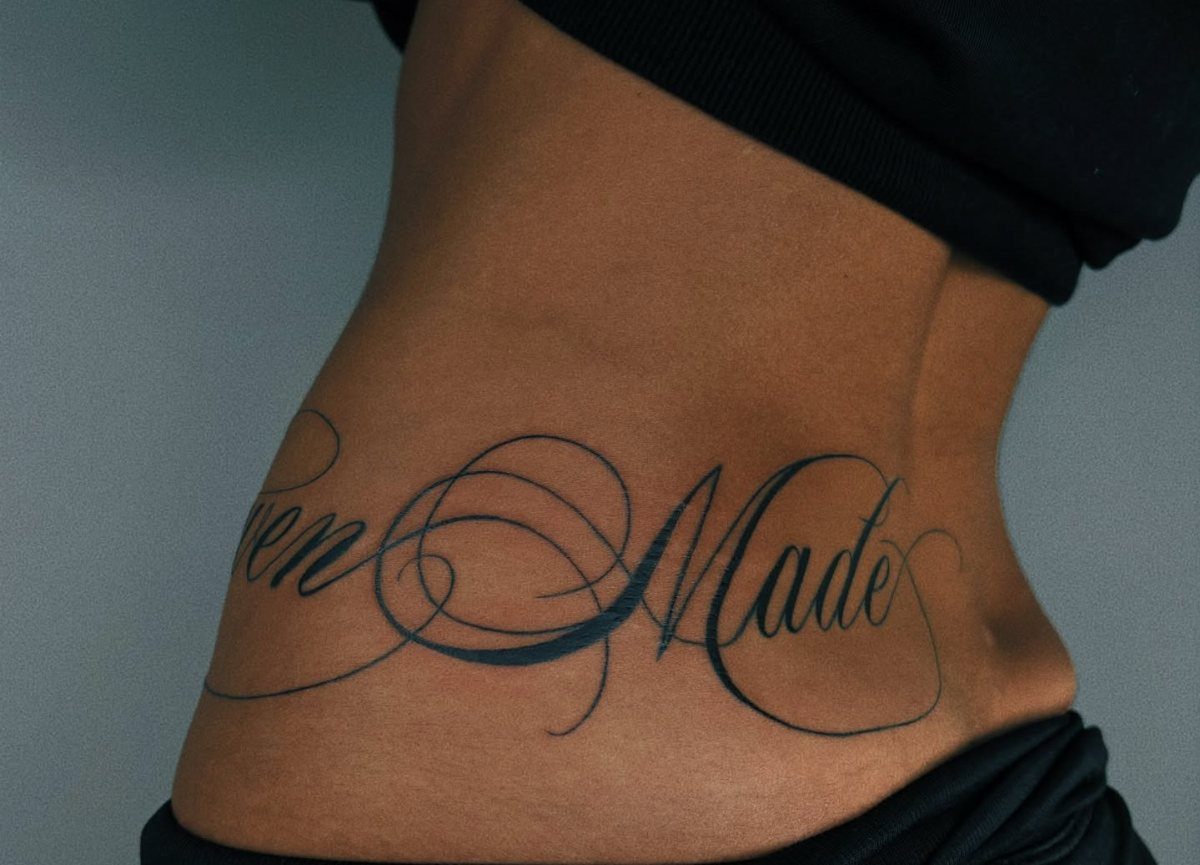
A phrase this wide turns the lower back into a banner rather than a whisper. The flourishes fill the space between words so the eye travels the full width without stopping; without them, the gaps would read as empty.
Large script needs the skin flat to stencil properly, so the artist should mark it with you standing, not lying down.
The scale means multiple sessions if the detail is dense; I would not try to finish this in one sitting.
Decorative swirls extend the piece toward the hips, which limits how high or low you can place it. Check that your usual waistband clears the bottom swirl; cutting through the design with clothing lines ruins the flow.

Cartridge Needles Sizes: 20 pcs tattoo cartridge needles include 3RL 5RL 5RM 7RM, each size has 5pcs. Those tattoo needles can be used for lining and shading, which can assist you with the entire tattoo work

【50PCS Mixed Tattoo Cartridge Needles Set】Includes 50 individually packaged tattoo cartridge needles in popular configurations: 1203RL, 1205RL, 1207RL tattoo cartridges, 1209RL, 1205RS, 1207RS, 1207M1, 1215M1, 1209RM, 1215RM (5pcs each). Suitable for both lining and shading needles for tattooing.

JimKing Tattoo needles and tips are packaged in a disposable sterilization box to prevent secondary infections.
10. Fallen Angel Cursive Script Tattoo
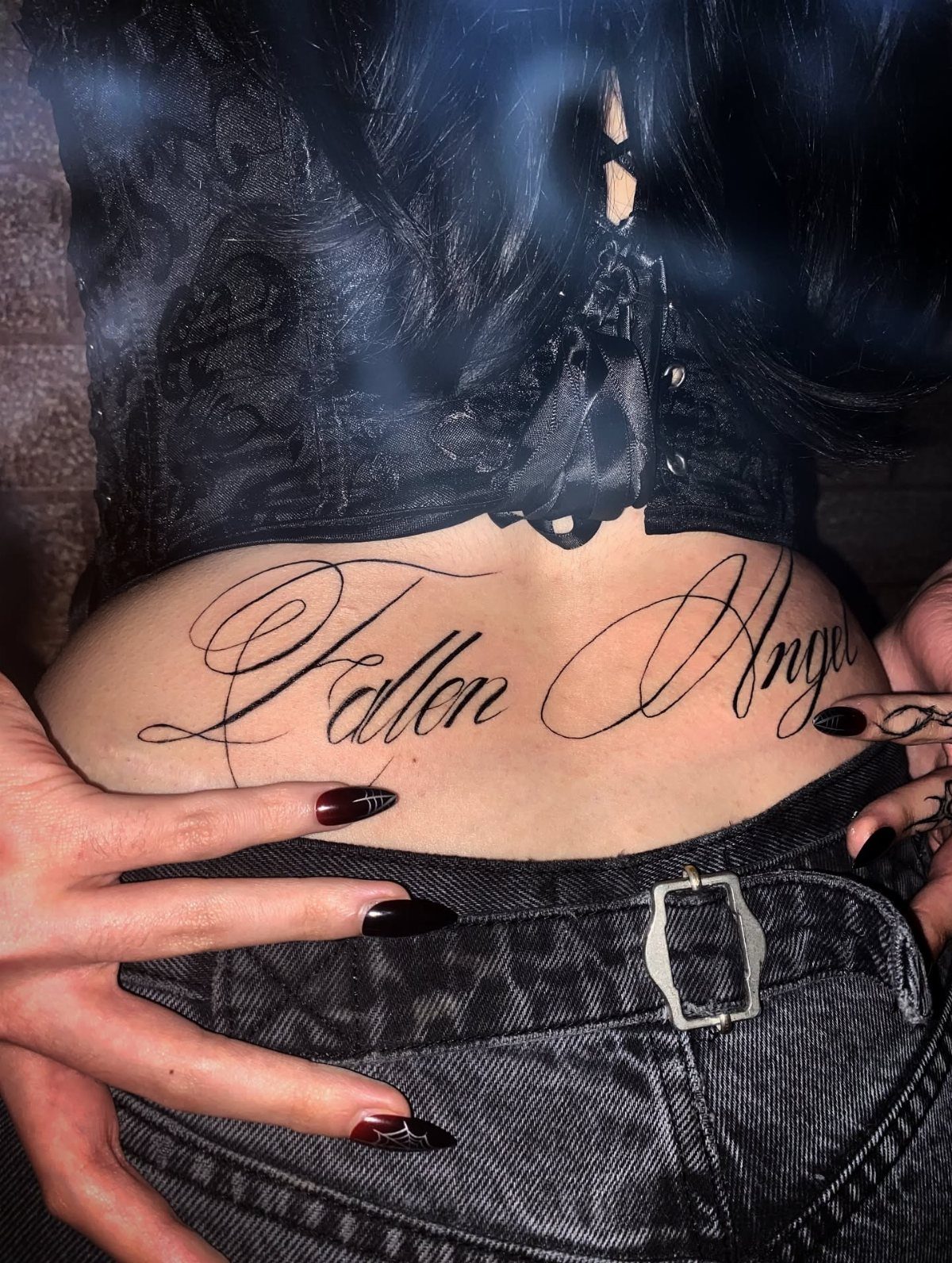
2 words with opposite weight: "Fallen" drops, "Angel" lifts.
The cursive connects them so the contrast reads as story, not contradiction. Corset and denim frame it as deliberate, not accidental; the styling signals the tattoo was planned, not hidden.
The ascenders on the F and A and the tail on the l create vertical movement that flatters the natural curve.
I would check that the word "Angel" does not arch too much with the spine; excessive curve makes script hard to read. Black ink is the right call here; color would fight the two-tone drama of the words themselves.

【Safe 】: Our tattoo transfer gel meets strict safety and non-toxic material standards, non-irritating to skin, vegan and skin-friendly, and allows clear, clean tattoo transfer.

🌿【Clean & Skin-Friendly Formula】 - Aloe-infused gel works on all skin areas (arms/back/face/legs). No ethanol or common irritants, lightweight for smooth application.

Fast & Long-Lasting Crisp Lines: The 100ml MIUXIA tattoo stencil gel creates sharp lines, capturing every detail of your artwork. It sets in minutes, forming a smudge-resistant layer, avoiding fading and blurring during long tattoo sessions and frequent wiping.
11. Lucky You Fine Line Cursive Tattoo

Small fine-line script is the most forgiving placement to start with and the hardest to keep crisp. "Lucky you" reads as private joke or invitation, depending on who sees it.
Fine line fades fastest where skin stretches and folds; the lower back does both. Fine line fades faster on skin that sees sun or friction; I would plan for a touch-up, sooner if you tan or wear low-rise daily.
The phrase is short enough that the artist can place it precisely; bring your own jeans to the appointment and mark where the waistband hits.
Elongated flourishes on the y and u extend the visual length without adding words; ask to see the stencil before the needle starts, as fine line is unforgiving of last-minute adjustments.