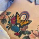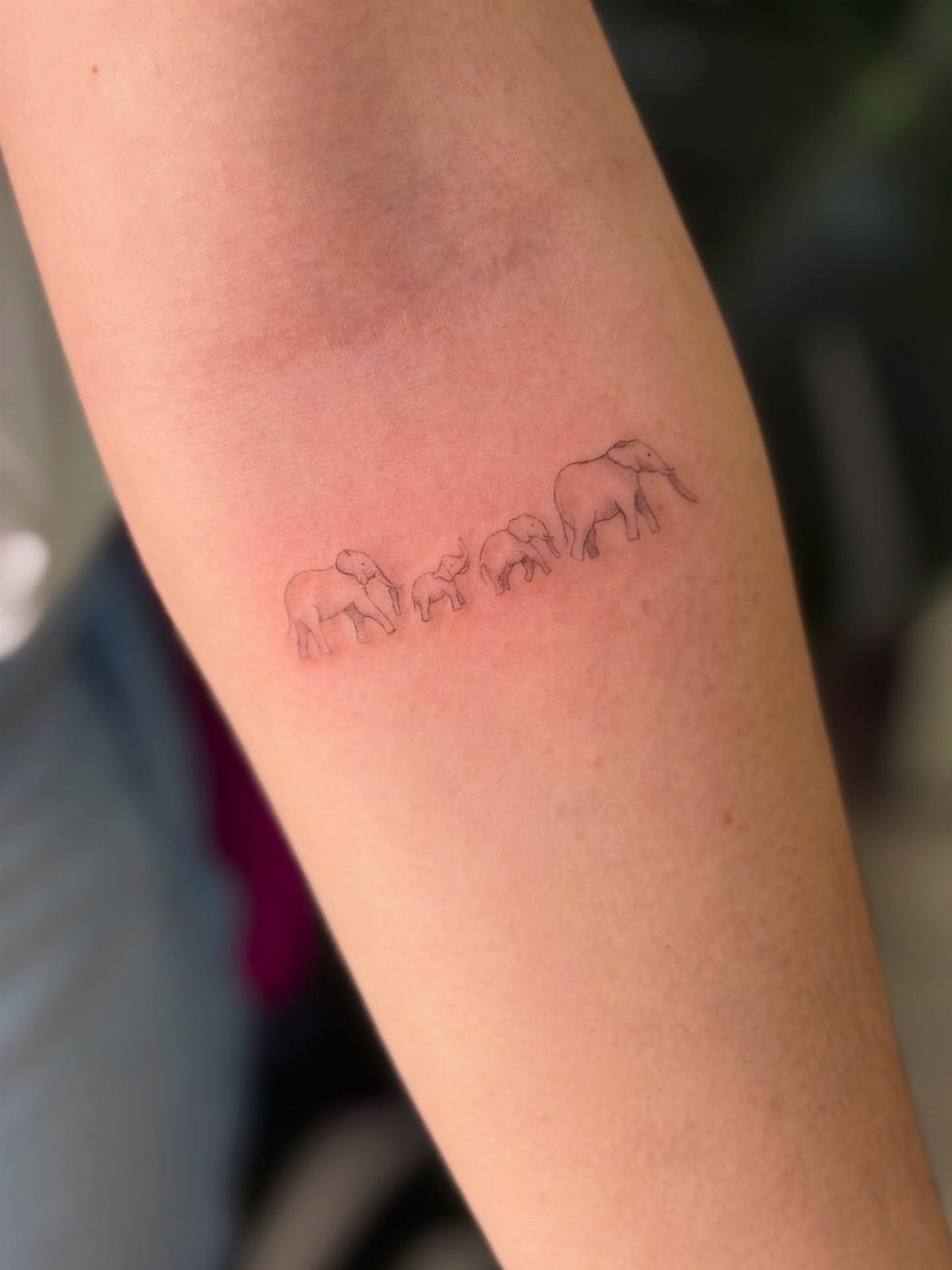
Fine line tattoos range from tiny finger symbols that need redoing within 2 years to continuous line portraits requiring an experienced hand and a longer sitting than the simplicity suggests.
The deciding factor is whether you can budget for touch-ups as part of the real cost, since this style fades faster than bold work and no amount of care stops a wrist line from bowing as the hand flexes.
Ask your artist to trace the design with your hand in several positions before the needle starts; that single check separates placements that hold from ones that distort.
1. Butterfly Tattoo
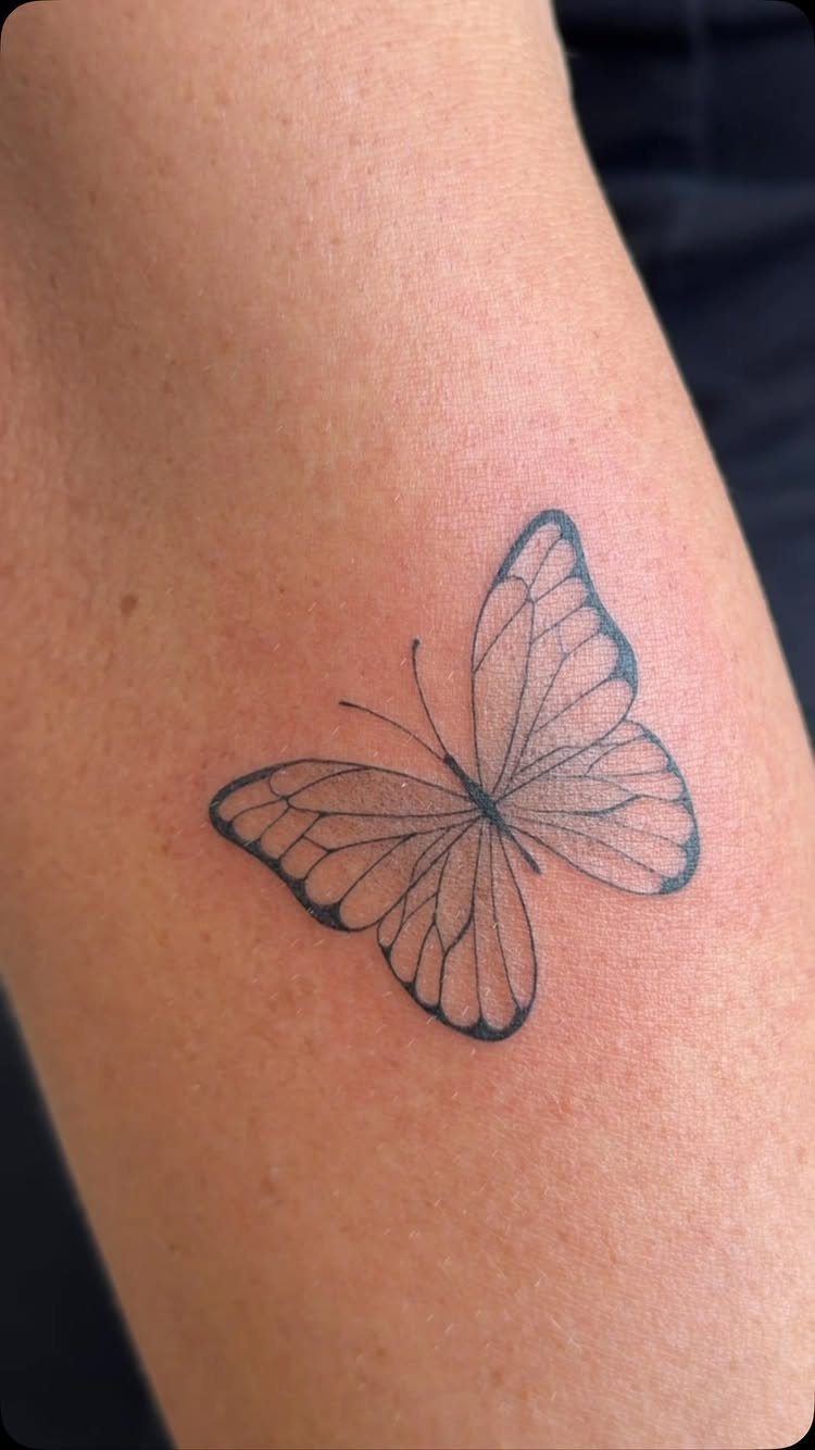
A fine line butterfly lives or dies by the wing detail.
The thin outline holds shape without heavy fill, and that is the version I would ask for: enough stippled shading to catch light, not so much that the lines blur together as the ink settles.
Placement matters more here than with bolder designs. The inner forearm or shoulder blade gives the artist flat skin to work on, which keeps those antennae lines from wobbling.
I have seen these done behind the ear, but the curve of the skull turns a symmetrical wing into something else by month three.
Ask to see healed photos from your artist, not just fresh work. Fine line black ink settles lighter than traditional, and the wing patterns you choose now need to still read as patterns later.
3MM Tiny Tattoo Practice skin Made from high-quality materials, it is closely mimic the texture and feel of real human skin. This gives you a realistic experience, allowing you to refine your skills before working on actual clients

Premium Quality 1.5mm Silicone Material – Crafted from premium 1.5mm thick silicone, this tattoo skin offers a true-to-life feel with excellent durability and a smooth surface for effortless needle movement during practice.

Premium Quality 1.5mm Silicone Material – Crafted from premium 1.5mm thick silicone, this tattoo skin offers a true-to-life feel with excellent durability and a smooth surface for effortless needle movement during practice.
2. Crescent Moon
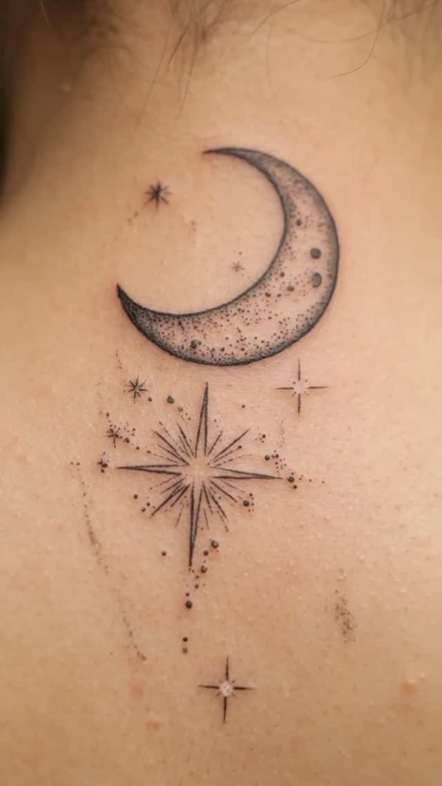
The crescent moon works because it carries meaning without demanding size. A vertical arrangement with trailing vines and scattered stars suits the spine or the side of the ribcage where a narrow shape follows the body naturally.
I like this best when the moon itself stays hollow, just the outline and stippled shadow, with the detail saved for what surrounds it.
The stippled texture and scattered stars give the eye somewhere to travel; without them, a standalone crescent can look like a sticker.
Stippling takes longer than solid fill, so budget the extra hour. A moon this size needs patience in fine line work, and rushing the dotwork is how you get a smudge instead of a glow.

💕【200+ PCS 20 Sheets Mixed Style】--VANTATY Lovely Cute Black Temporary Tattoos For Women Men Adults Body Art Stickers Look Real! Tiny Infinity Geometric Arrow Smile Face Flowers Crescent Moon Sun Stars Temporary Tattoos For Hands Fingers, Realistic Small Butterfly Love Heart Mountain Birds Feather Snake Cat Dog Tattoos For Ear Neck Arm Hands Temp Tatoos Decals.【Click Our Store/brand Name To See More Fashion Designs】

MINIMALIST CELESTIAL ELEMENTS: Features a delicate collection of radiant sunbursts, crescent moons, and sparkling North Stars. The artwork is crafted using a digital hand-drawn fine line tattoo technique, delivering crisp geometric contours, micro-sparkle accents, and timeless bohemian aesthetic charm.

BOHO SUN & MOON CHANDELIER: A central sunburst, two crescent moons, tiny stars, dotted chains, and long hanging lines form a symmetrical celestial ornament. Fine linework gives the composition an elegant jewelry-like flow.
3. Continuous Line Drawing
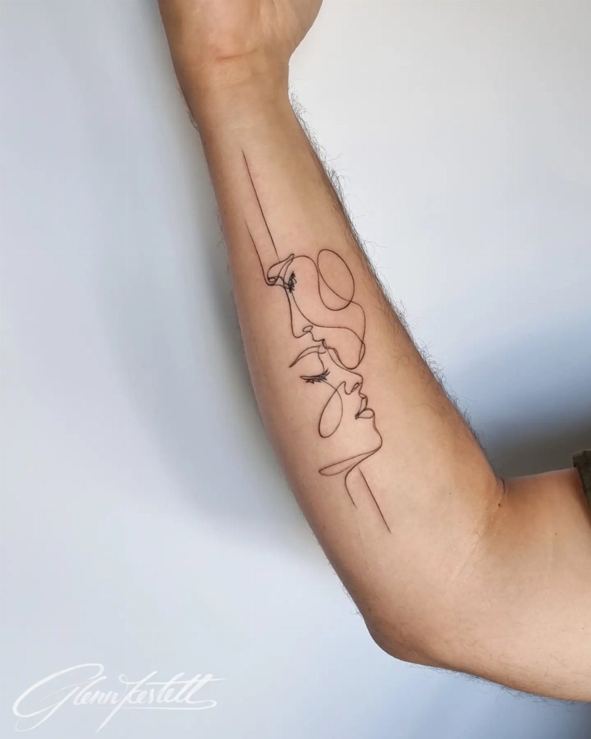
Continuous line drawing is the one fine line style where the artist cannot hide a shake. One unbroken black line forms the whole image, two faces in profile here, and any wobble becomes part of the design forever.
The technique looks simple and costs more than it looks. An experienced hand keeps the line weight even from start to finish, and that control takes years, not months.
A sitting cat or embracing figures work as fine line tattoos only if the subject reads in silhouette alone, because there is no shading to rescue it.
I would plan this for the forearm or calf, somewhere the viewer sees it from one consistent angle. Two faces work because they share one contour; from the wrong angle, a continuous line portrait collapses into abstraction.

Poseidon cartridge adopt a one-time joint design hygienic standard The material is stainless steel and easy to color,and has better ink flow

Complete Packaging: 50pcs mixed size tattoo cartridge needles set, includes 5pcs each of 1205RL 1207RL 1209RL 1205RS 1207RS 1209RS 1207RM 1207M1 1215M1 1215RM. The unique design of the needle can store more ink, and the sharp needle thread better completes tattoo activities, suitable for both professional tattoo artists and beginners.

Cartridge Needles Sizes: 20 pcs tattoo cartridge needles include 3RL 5RL 5RM 7RM, each size has 5pcs. Those tattoo needles can be used for lining and shading, which can assist you with the entire tattoo work
4. Geometric Designs
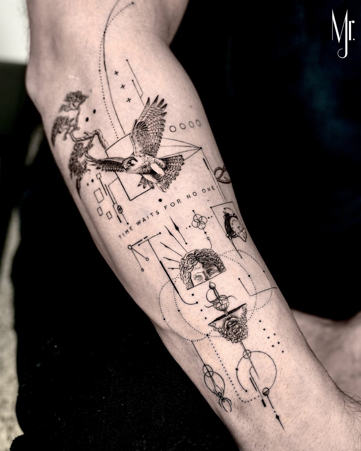
Geometric fine line sits at the edge of what this needle style can hold.
The photo mixes a bird, a split face, and straight line work with text, which tells me the artist planned the composition as one grid rather than adding pieces later.
That planning is the part you control.
If you want multiple small symbols across a forearm, the spacing between them matters more than the symbols themselves. The reference shows varied images held together by consistent line weight; without that consistency, you get a sticker sheet.
I would decide before the appointment whether to include lettering. Text in fine line needs more frequent touch-ups than image work, and mixing the 2 means planning for different aging rates from the start.

6 Pack of Surgical Skin Markers. Individually Sealed, Sterile.

Precision Tattoo Marking:Get precise and clean lines with our tattoo stencil pen featuring fine point tips, ideal for outlining designs before tattooing or piercing. These aluminum alloy purple tattoo pen refills are methanal-free for safe skin use. Each pack includes 20pcs of tattoo markers and one pen shell

Premium & User-Friendly Design: Crafted from top-notch materials, these pen cores feature a 1.6mm tip for precise, clear lines. Their easy-to-use design ensures smooth operation, whether you’re a pro artist or a beginner
5. Small Text Tattoos
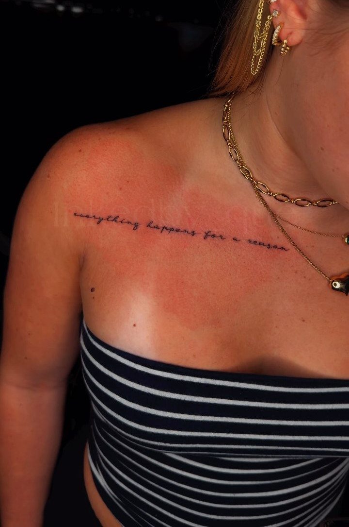
Collarbone script looks effortless and tests an artist’s spacing discipline. A phrase running along the bone itself, not above or below it, keeps the line straight while the skin moves.
Cursive in fine line spreads faster than print. I would choose a serif or clean sans-serif if I wanted the tattoo to read clearly for longer, or accept that this version of cursive will soften into something more atmospheric.
Vertical arrangements work better for single words than phrases; a sentence turned ninety degrees becomes hard to read even before aging sets in.
Thin skin there bruises and reddens easily with fresh work, so expect more visible irritation during healing. Plan for a longer heal than arm or leg placements, and avoid straps or necklaces until the skin has fully settled.

Tiny Tattoo Practice Skin: the double-sided, easy-wipe, fine-line tattoo practice skins feature over 80 different stencil designs on the front and back of the skin.
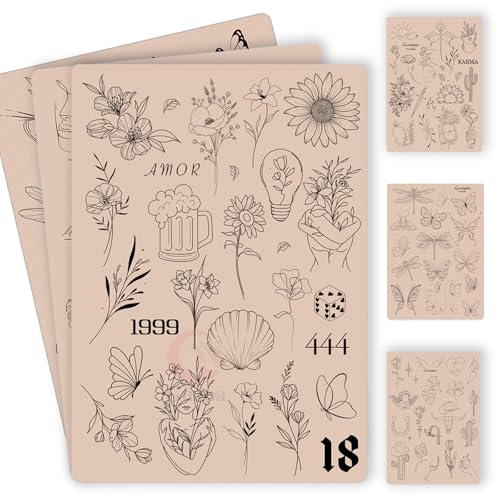
100+ Pre-Printed Designs – Features a wide variety of fine line and tiny tattoo stencils to enhance detailing skills.

Premium Quality 1.5mm Silicone Material – Crafted from premium 1.5mm thick silicone, this tattoo skin offers a true-to-life feel with excellent durability and a smooth surface for effortless needle movement during practice.
6. Small Symbols
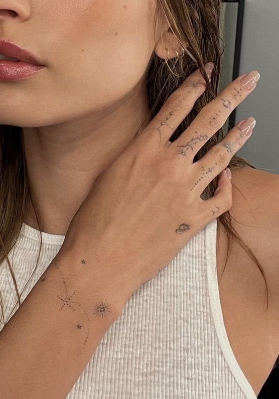
Finger and hand tattoos trade visibility for longevity. The stars and small celestial marks sit where daily use and sun exposure hit hardest, which means fine line work here fades faster than a sheltered placement.
I would keep these smaller than the reference shows, and scatter rather than cluster.
A single star on each finger reads longer than three competing for space on one knuckle. The celestial set, sun, moon, tiny cloud, gives you a vocabulary to build over time rather than exhausting the canvas in one session.
These are the tattoos everyone sees, and the ones that need redoing first. Budget for that, or choose a less public placement and keep the same symbols at the size they need to last.

Premium Quality 1.5mm Silicone Material – Crafted from premium 1.5mm thick silicone, this tattoo skin offers a true-to-life feel with excellent durability and a smooth surface for effortless needle movement during practice.

Premium Quality 1.5mm Silicone Material – Crafted from premium 1.5mm thick silicone, this tattoo skin offers a true-to-life feel with excellent durability and a smooth surface for effortless needle movement during practice.

Premium Quality 1.5mm Silicone Material – Crafted from premium 1.5mm thick silicone, this tattoo skin offers a true-to-life feel with excellent durability and a smooth surface for effortless needle movement during practice.
7. Dandelion Seeds
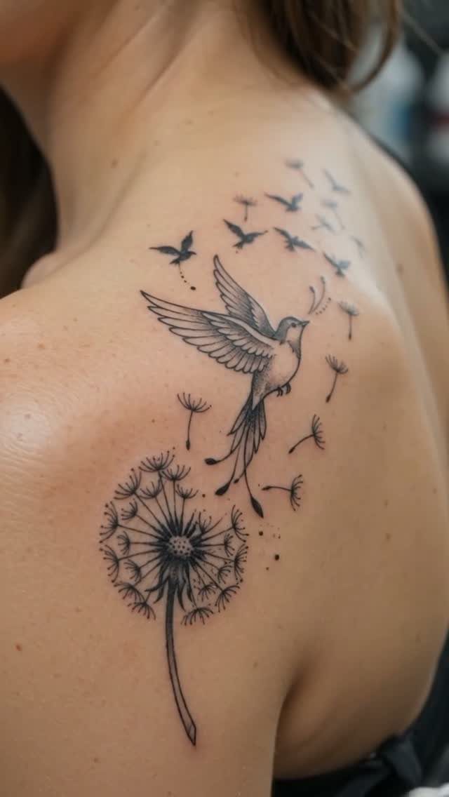
The scattered seed pattern turns a single flower into movement across the skin. On a shoulder blade, the dandelion clock sits at the anchor point with seeds drifting toward the collarbone or spine, following the body’s own lines.
I would ask for the stems to stay separate, not bundled.
Wispy tops need room to read as individual seeds; cluster them and the fine line work turns to fog. The birds some versions add work best when they are small, just enough silhouette to suggest flight without competing for detail.
Stippled shading on the seed heads gives them weight against bare skin. Without it, the white tops disappear on lighter complexions.

CELESTIAL SUN AND MOON ART: Features a beautiful symbolic pairing of the cosmos across two independent sheets: one showcasing a radiant, flaming sunburst and the other depicting an ornate bohemian crescent moon flanked by geometric lines. This mystical motif is crafted using a digital hand-drawn fine line tattoo ensures crisp lines to keep the delicate starburst sparkles, fine dots, and long vertical alignment lines perfectly sharp and elegant.

【Sun & Moon Fine Line Tattoo Design】This fine-line Sun & Moon semi permanent tattoo set celebrates balance, duality, and harmony—light and dark, strength and calm. The clean minimalist design feels modern yet symbolic, making it perfect for those who appreciate celestial themes and want a meaningful reminder of balance and wholeness in everyday life.

Innovative Skin-Sync Technology: We don't just sit on the skin; we interact with it. By reacting organically with naturally occurring proteins in your skin's outermost layer (stratum corneum), our plant-based formula magically transforms from a transparent guide into a rich, ultra-realistic navy-black. It looks exactly like a healed, permanent tattoo—without the needles or depth.
8. Minimalist Animal Tattoos

A giraffe in fine line lives on the neck length. A giraffe head works best with just the outline and a few stippled spots; enough detail to recognize the animal, not so much that it reads like a textbook illustration.
Fish and birds work the same way: one identifying feature carried by line alone.
For a koi, the flowing tail does the work; for a sparrow, the forked tail and the angle of the beak. I would choose the single trait that reads at a glance and let the rest stay outline.
Red ink holds differently than black in fine line, fading faster and sometimes spreading.
Color in fine line animal work fades faster than black, so plan either for more frequent touch-ups or keep the animal itself in black ink and use color only for small accents that can soften gracefully.

Package: 50pcs mixed size tattoo cartridge needles set, includes 5pcs each of 1005RL, 1007RL, 1009RL, 1205RS, 1207RS, 1209RS, 1015M1, 1021M1, 1015RM, 1021RM; Those tattoo needles can be used for lining and shading, which can assist you to complete the entire tattoo work

50PCS ASSORTED TATTOO NEEDLES: Includes 5 pieces each of 1005RL, 1007RL, 1009RL, 1205RS, 1207RS, 1209RS, 1015M1, 1021M1, 1015RM and 1021RM — ten types covering lining, shading and color packing in one box. Note: 0.30mm (#10) needles use slimmer shells (e.g., 1007RL fits a 5RL shell); needle size and taper are exactly as listed.
Package includes 10 pieces of each size: 3RL, 5RL, 7RL, 9RL, 3RS, 5RS, 7RS, 9RS, 5M1, 7M1
9. Heart Tattoos
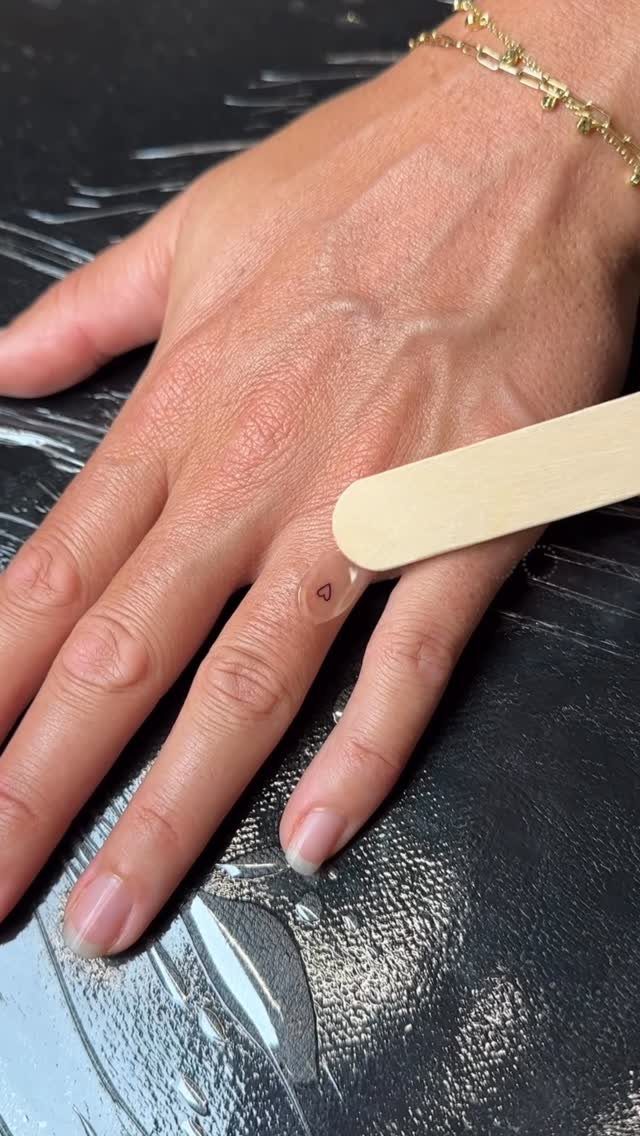
Finger placement for a heart this small trades longevity for visibility. The ring finger sees water, soap, and friction daily, and fine line work there often needs refreshing within 2 years.
The version I would choose for staying power is the hands-cradling shape, placed on the inner forearm where skin stays flatter and sheltered.
The daisy details in that variation give the heart a frame without adding weight; the negative space between the fingers and the flower stems lets the line breathe.
Continuous line hearts with a cat tail or other tail ending work best when the connecting line stays single weight. A thickening where the heart meets the animal body reads as a mistake, not a design choice.

What's Kit Included: Complete tattoo machine kit comes with everything you need to get started and then some, from the stencil printer to tattoo cartridges and practice skin. 1 tattoo stencil printer, 1 adjustable stroke tattoo machine, 10 tattoo needles, 10 transfer papers, 2 practice skins, 40 ink cups, 2*15 ml black tattoo ink, 2 dental bibs, 3 tattoo stickers, a pair of gloves and a easy to carry case.

Beginner-Focused All-in-One Kit: Designed specifically for aspiring tattoo artists, this complete Wormhole tattoo kit includes everything you need to start learning and practicing tattoo artistry—no extra purchases required; It comes with a rotary tattoo gun, power supply, 20 cartridge needles, 20 color inks, practice skins, and essential accessories, making it the perfect entry-level package for anyone exploring tattooing

Complete Starter Tattoo Kit: Includes an aluminum alloy rotary tattoo pen, power supply, foot pedal, RCA cord, 20 cartridge needles, 8 bottles of 30ml ink, 2 transfer papers, practice skin, 40 ink caps, grip cover, gloves
10. Lotus Flower
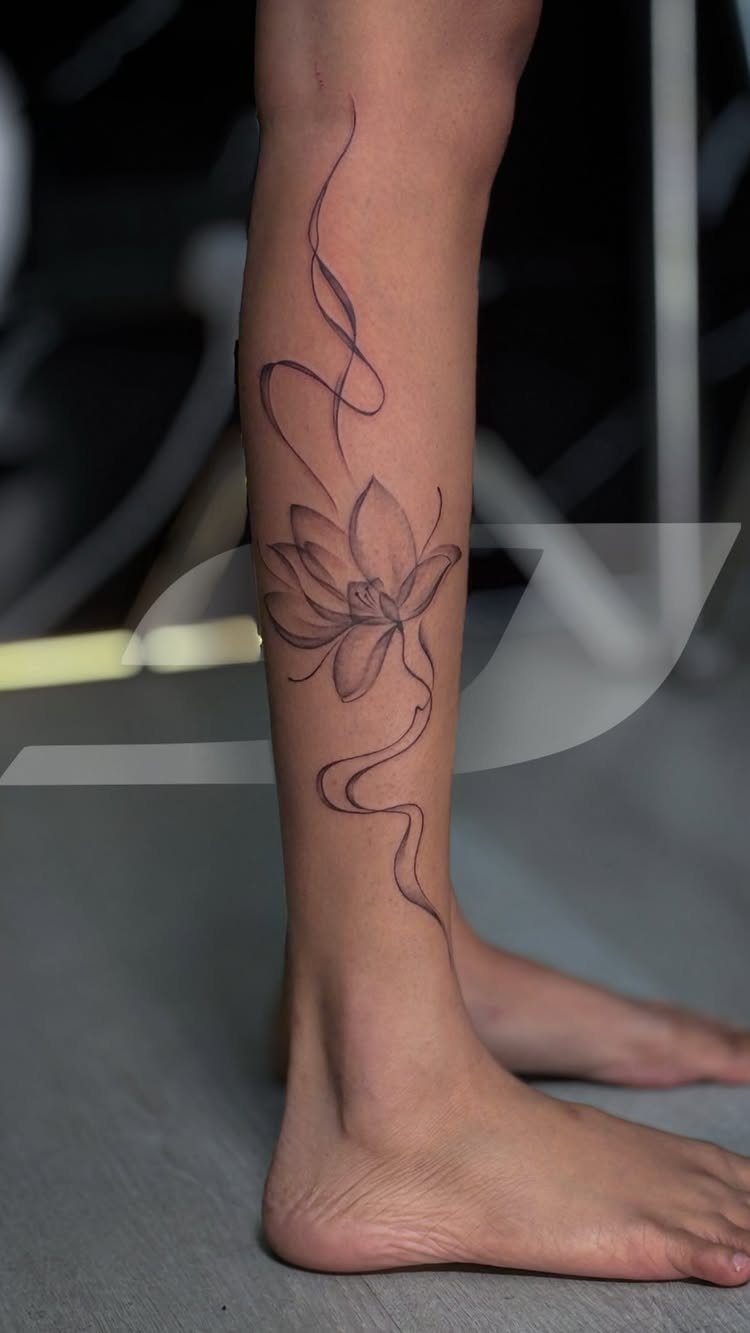
Vertical lotus arrangements follow the body’s long muscles well, calf or forearm or the line of the spine.
The flowing ribbons in the reference soften the geometry of the petals; without them, a lotus in fine line can look too symmetrical, too emblem-like.
I would ask for the petals to vary slightly in length, not mirror-perfect. Dots and small moons placed above and below the lotus turn a single flower into a longer composition that fills more space without crowding the design.
Those additions need the same line weight as the petals themselves, or they read as afterthoughts.
The lower leg puts a lotus in direct path of sun exposure and sock friction, both of which speed fading on fine line work.
Plan for more fading than a sheltered placement, and consider whether the ribbons should wrap toward the ankle or stay on the calf flat.

Design Experimentation:Our finger Tiny Tattoo tattoo practice pad with more than 80 stencil designs,it can nables artists to experiment with new designs, patterns, and shading techniques.

Innovative Skin-Sync Technology: We don't just sit on the skin; we interact with it. By reacting organically with naturally occurring proteins in your skin's outermost layer (stratum corneum), our plant-based formula magically transforms from a transparent guide into a rich, ultra-realistic navy-black. It looks exactly like a healed, permanent tattoo—without the needles or depth.

Innovative Skin-Sync Technology: We don't just sit on the skin; we interact with it. By reacting organically with naturally occurring proteins in your skin's outermost layer (stratum corneum), our plant-based formula magically transforms from a transparent guide into a rich, ultra-realistic navy-black. It looks exactly like a healed, permanent tattoo—without the needles or depth.
Tattoo Placement Advice
Fine line work needs flat skin more than bold styles do. The wrist moves constantly, and a line that looks straight at rest can bow or gap when the hand flexes.
Before the needle starts, I would ask the artist to trace the design with my hand in several positions, not just palm down.
Vertical compositions on the outer arm read well because the viewer sees them from one angle.
A shoulder piece that wraps onto the chest or back loses coherence as the body turns, and fine line does not have the weight to carry a design across that many planes.
The upper arm inside surface, above the elbow crease, holds detail longer than the forearm underside.
Less sun, less flexing, and the skin there stays more stable through weight change. For a first fine line piece, that placement buys you time before touch-ups.
Meaningful Tattoo Elements
A symbol gains meaning from what the wearer brings, not from the dictionary.
The butterfly as transformation is a common reading, but the same shape can mark a specific spring, a person, a year. The element that already has a private association works better than one adopted just for the tattoo.
The moon’s phase matters more than the moon itself.
A waxing crescent reads as beginning, a waning one as release, and a full moon as something else entirely. The same line drawing carries a different weight depending on which phase you choose, so the decision is worth the time.
Multiple symbols in one composition need a reason to share space. A butterfly, moon, and stars together work when they relate to a single memory or season; without that connection, the arrangement becomes a collection rather than a design.
I would limit myself to two or three elements and let the spacing between them do some of the talking.
Cost Considerations
Fine line sits at a pricing crossroads. The work takes longer per square inch than traditional bold line because there is no margin for error, yet the result looks smaller and simpler.
Some artists price by time, others by piece complexity, and the same design can quote differently across shops.
A single continuous line portrait or geometric composition needs an experienced hand.
That experience costs more hourly, and rushing to save money shows permanently in this style. I would plan for the sitting to run long rather than hoping for speed.
Touch-ups are part of the real cost. Fine line fades faster, especially on high-use placements, so I would budget for a refresh before the work turns unreadable.
Ask whether the original artist includes one touch-up in the initial price; some do, many do not, and that difference matters more than the session rate itself.