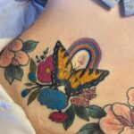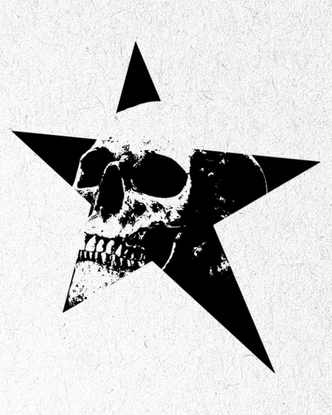
These 8 designs run from a single red-eyed bird to full sleeve work, and the deciding factor is how much skin you are ready to give.
A winged silhouette needs only a shoulder blade or calf to read clearly, while the cat-and-leaf sleeve demands the arm and the commitment that comes with it.
The Mike Tyson portrait and the 3 stacked eyes both rely on the same discipline: heavy black shading placed exactly, with no mid-tone grey to muddy the shape over time.
1. Silhouette of a Winged Figure
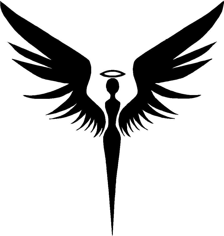
A solid black silhouette reads from across a room, which is exactly what high contrast is for. A halo and outstretched wings keep the shape readable even at thumbnail size.
Stippling or heavy shadow work inside the silhouette adds texture without breaking the outline. I would ask the artist to keep the negative-space details large enough; fine lines inside solid black tend to blur together after a few years.
This works best placed where the wingspan fits naturally: across a shoulder blade, down a ribcage, or wrapping a calf.
The figure does not need to be literal; a bird silhouette with a sword or spear shape reads the same way and carries less specific meaning.
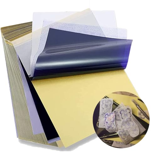
Standard size: Tattoo Transfer Paper is standard A4 paper size, each measures 8.27 in X 11.69 in. There are 4 levels in total. The thickness of the paper is very light and smooth to the touch.

Precision Transfers & Long Lasting: Tattoo stencil paper delivers vibrant, high-definition transfers even for intricate designs. Creates crisp, dark lines that transfer cleanly to skin (clearly on different skin tones) which are easy to follow during tattooing. The carbon layer made from high-quality dyes ensures sharp outlines without smudging or fading and maintains crisp lines visibility throughout long tattoo sessions, so you can focus on creating art instead of re-drawing lines

Warm Tips: The tattoo transfer paper need to work with transfer medias.You will need to purchase the stencil ointment separately. Apply the design made on the master paper. Please pay attention to press the back side of the pattern to the skin for at least 3 seconds
2. Skull Designs
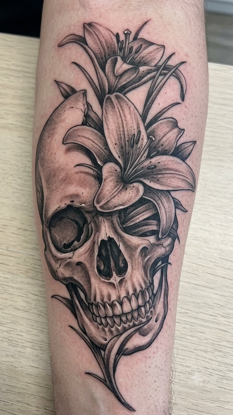
Skulls and lilies pair naturally because the flower’s pale petals let the artist push light values right up against dead black.
Lilies wrapped through the skull’s eye sockets and jaw keep both elements active rather than one sitting on top of the other.
Dice-shaped skulls are another direction, though I would think twice before committing to a gambling motif unless it actually means something to you.
The lily version ages better; floral detail gives the eye more to follow as the bold outlines soften slightly over time.
For placement, the upper arm or outer thigh gives enough flat area for the skull’s roundness to read true.

Vibrant Pink, High-Contrast Tattoo Transfer Paper: KVM tattoo transfer paper produces vivid, high-contrast pink impressions that accurately reproduce intricate artistic details. Coated with high-quality vegetable wax, it is gentle on the skin and suitable for all skin tones. The lines are clear and sharp, resist smudging, and remain stable during the tattooing process, making it ideal for portraits, line art, and shading designs.

Clean, Flawless Transfers: Your artwork will look so clean once transferred to the skin with the Stencil Stuff gel! Gentle on the skin, Stencil Stuff transfer solution helps you achieve clear and sharp tattoo stencil transfers every time!

CRISP, DARK, RESIDUE-FREE TRANSFERS — Our premium 4-layer tattoo stencil paper delivers high-contrast, razor-sharp lines that show every detail of your design on skin. No blobs, no smudging, no blue residue left behind — just clean, professional stencils every time you transfer.
3. Decorative Crosses
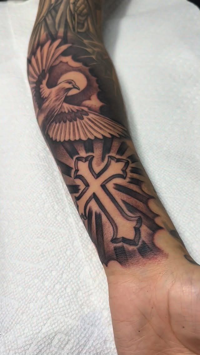
Filigree and scrollwork turn a simple cross into something that holds attention up close, but the high contrast comes from how the black ink pools in the recesses while the raised lines stay skin-toned.
A dove and radiating beams add motion without cluttering the center.
Symmetry matters more here than in most tattoos; a cross that leans even slightly looks wrong immediately.
I would check the stencil twice before the needle touches skin, and I would not let the artist freehand the scrollwork unless I had already seen their line consistency on similar pieces.
Forearm placement keeps it visible, which suits a design with this much personal or spiritual weight.

100% new brand and high quality. Favored among professional tattoo technicians.

MADE IN THE USA SINCE 1990: For over 30 years Dynamic Color has produced professional tattoo ink in the United States, an established American brand artists built their work on long before most imported labels existed.

Versatile Practice Material: Set of 3 double-sided blank tattoo skins for training on semi-permanent makeup, eyebrow microblading, and tattooing techniques.
4. Black Ink Flowers
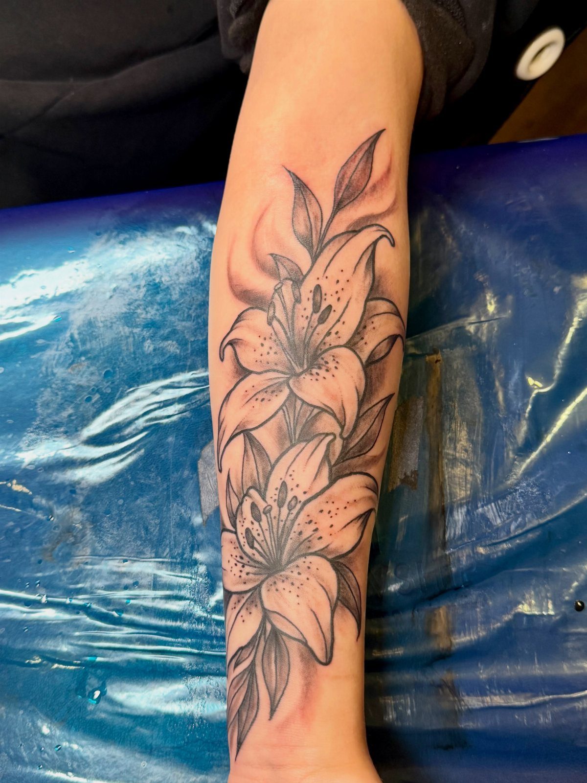
Large lilies work in pure black ink because the shading builds volume without needing color to separate petals from leaves. 2 full blooms with leaves below, the negative-space outlines keeping the inner petal edges crisp against the darker outer tones.
Shoulder and upper arm placement lets the flowers drape naturally, following muscle shape rather than fighting it. A stencil-style silhouette pattern reads more graphic and less botanical, which suits a different taste but uses the same black-ink discipline.
I prefer the shaded version for skin, where a flat silhouette can look more like a decal than a living piece.

Poseidon cartridge adopt a one-time joint design hygienic standard The material is stainless steel and easy to color,and has better ink flow

Mast Pro purple tattoo cartridges needles have been providing with high density clear plastic body

Complete Packaging: 50pcs mixed size tattoo cartridge needles set, includes 5pcs each of 1205RL 1207RL 1209RL 1205RS 1207RS 1209RS 1207RM 1207M1 1215M1 1215RM. The unique design of the needle can store more ink, and the sharp needle thread better completes tattoo activities, suitable for both professional tattoo artists and beginners.
5. High-contrast Portraits
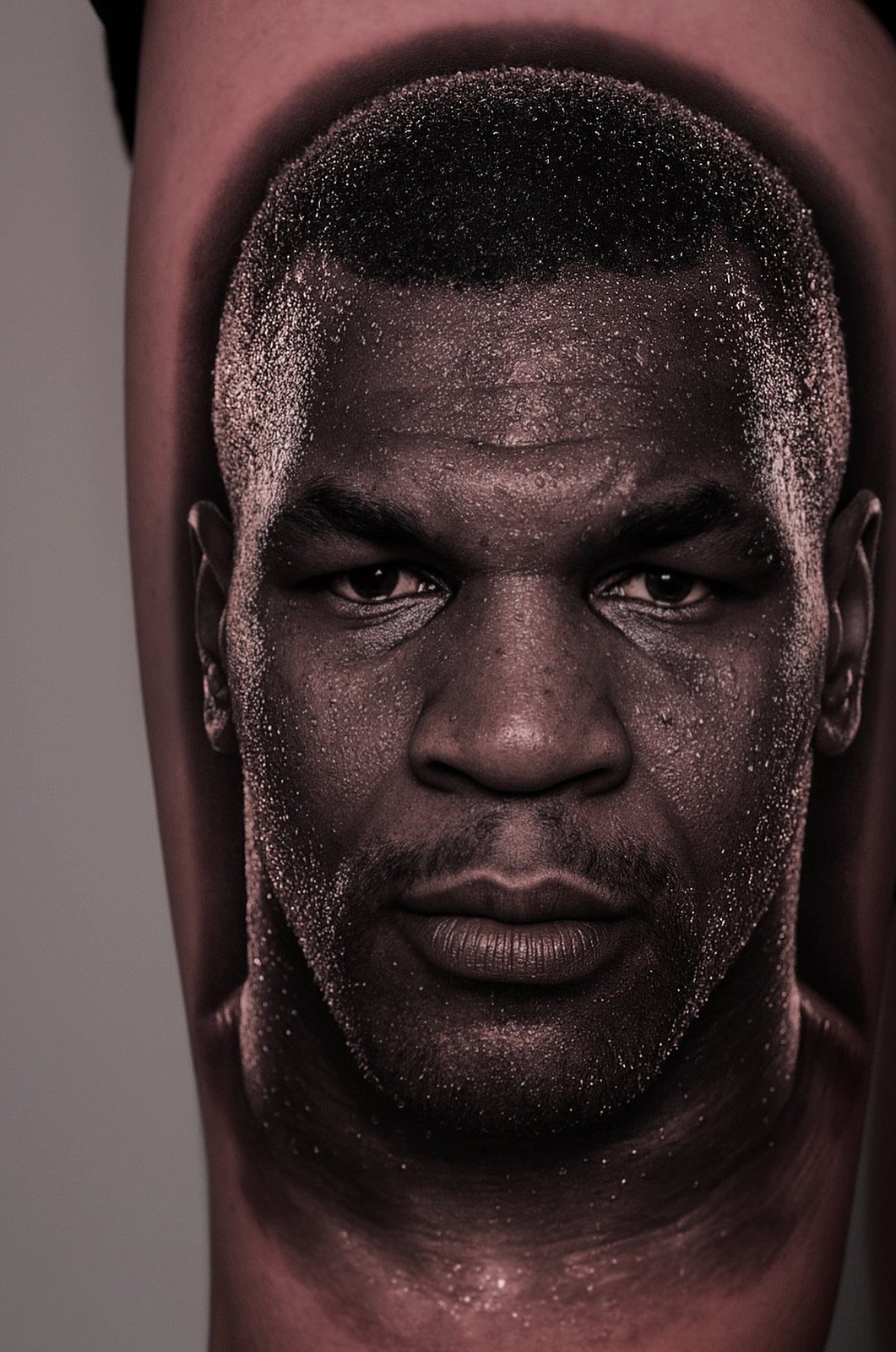
Heavy black shading defines the jawline, the eye socket depth, the sweat catching light; without it, a portrait tattoo goes muddy fast.
The Mike Tyson piece pushes this to an extreme, almost noir lighting, which is harder to pull off than it looks.
A woman’s profile with flowing hair offers more built-in negative space to work with, letting the artist place solid black strategically rather than everywhere.
A split-face skull variation trades likeness for symbolism; I would only go that route if the person portrayed would have wanted it.
Portrait work demands an artist with specific experience in this style. General black-and-grey skill is not enough.

COMPLETE AFTERCARE KIT FOR NEW & EXISTING TATTOOS: This Tattoo Aftercare Kit brings together 3 essentials, Antimicrobial Soap, Tattoo Balm, and Tattoo Lotion, to help cleanse, protect, and moisturize fresh ink. Useful after tattoo sessions and throughout healing, it supports vibrant color and skin comfort for dedicated ink enthusiasts and artists

🌿 VIBRANT COLOR & DEEP MOISTURE - Crafted with nutrient-rich a&d ointment, our balm deeply hydrates freshly inked skin. It supports your natural moisture barrier, keeping body art and microblading looking bold and beautifully vibrant.

Nourishes Healing Ink for Vibrant Color: Tattoo Goo supports healing tattoos & maintains vibrancy on healed ink with a lightweight formula rich in olive oil, lavender oil, cocoa butter, and beeswax. It absorbs quickly, moisturizes deeply, and helps reduce dryness, itch and tightness so your tattoo looks and feels comfortable through everyday routines
6. Stylized Eyes
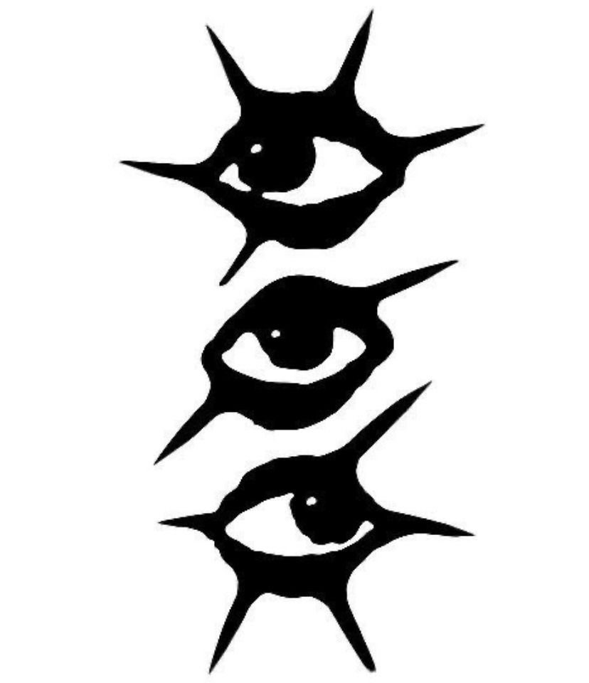
3 eyes stacked vertical with thorn lashes make a graphic impact that a single eye would not; the repetition turns a symbol into a pattern.
Concentric circle pupils keep the design abstract enough that it reads as icon rather than portrait, which matters for longevity.
The swirling liquid background is a separate option; I would keep the background solid white if the placement is busy with other tattoos nearby, or add the swirls if this piece needs to carry a whole forearm or calf on its own.
Thorn details around the edges need consistent line weight; uneven spikes look like a mistake rather than a style choice. I would watch the artist’s first eye closely before letting them continue to the second and third.

1️⃣[Inkjet Stencil Ink for Printer] Capture every fine line and subtle shading of your artwork with high-resolution printing. Designed for professional tattoo artists, this stencil ink ensures that complex geometric patterns and realistic portraits are perfectly transferred to the skin, eliminating the errors and time-consuming nature of manual tracing.

THE #1 STENCIL PAPER FOR INKJET STENCILS:Designed to be the perfect match for your InkJet Stencils system, the InkJet Stencils tracing paper is the best choice you can make for printing any artwork and transferring it to the client's skin. Custom cut to fit desktop InkJet printers, every stencil will look perfect. No jamming, no issues.

🔥 4-Layer Professional Precision : Achieve ultra-sharp tattoo stencils with Yuelong’s 4-layer system (white master + carbon layer + protective tissue + yellow backing)! Delivers smudge-free transfers for intricate designs—ideal for tattoo artists demanding accuracy on every line.
7. Cat and Leaf Sleeve
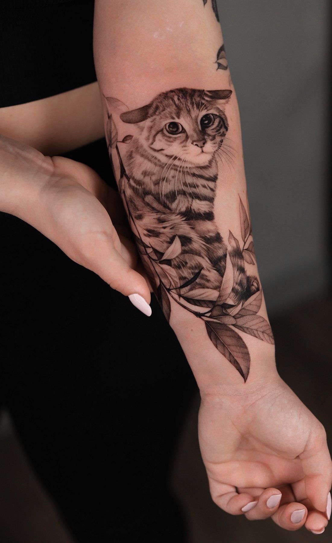
A tabby cat’s face pushed forward through leaves reads as a portrait without the pressure of exact likeness. The fur texture comes from directional line work; leaves frame the face and give the eye somewhere to rest.
I would keep the cat’s eyes as dark pools rather than adding color. Black-and-grey realism depends on value range, and a mid-tone eye would flatten the whole piece.
Sleeve placement means this sits among other tattoos or becomes the start of a larger story. Leaves extend easily into background filler; the cat stays the focal point because mammals draw attention faster than plants.
Vibrant Pink, High-Contrast Tattoo Transfer Paper: KVM tattoo transfer paper produces vivid, high-contrast pink impressions that accurately reproduce intricate artistic details. Coated with high-quality vegetable wax, it is gentle on the skin and suitable for all skin tones. The lines are clear and sharp, resist smudging, and remain stable during the tattooing process, making it ideal for portraits, line art, and shading designs.

Safe and Healthy: Our tattoo transfer gel meets strict safety and non-toxic material standards, non-irritating to the skin and vegan-friendly. Maintains client comfort while achieving clear tattoo stencil transfers.

【Safe 】: Our tattoo transfer gel meets strict safety and non-toxic material standards, non-irritating to skin, vegan and skin-friendly, and allows clear, clean tattoo transfer.
8. Dark Bird with Red Eye

A single red eye in an otherwise black-and-grey bird turns a nature piece into something else entirely. The red is small enough to stay striking for years; a large red field would fade to pink and lose the effect.
Japanese-style waves behind the bird give the composition motion without competing for attention. The wave pattern repeats; the bird breaks it once, the eye breaks it again.
I would place this where the bird’s head sits at a natural viewing height: outer thigh, upper arm, or ribs if the scale works.
The red eye demands a skilled hand with color packing; uneven saturation reads as an injury, not a choice.

【PREMIUM 3MM THICKNESS】Our practice skins are crafted from 3mm thick, professional-grade silicone to deliver an authentic tattooing experience. This optimal density provides superior needle resistance, elasticity, and durability — just like real skin. Perfect for mastering stretching techniques, shading, and outlining without the pressure of working on live models.

📏1.3mm Professional Grade - 30 sheets of 1mm thick synthetic skin with dermis-like texture, certified by tattoo artists for real needle feedback and ink absorption. Ideal for beginners to avoid mistakes on real clients.

High Contrast Tattoo Benefits
High contrast work does more than catch the eye from across a room.
The sharp division between black and skin tone forces the brain to read shape before detail, which means the tattoo communicates instantly even in poor light or at a glance.
That matters for placement on moving parts, where a softer design would blur into visual noise.
Detail survives longer too. Where a mid-tone grey might fade into the surrounding skin, a solid black line stays readable because the contrast with bare skin is still there.
The eye fills in what time softens. Negative space acts the same way; the skin you leave untouched ages with you, but the black beside it keeps defining the shape.

BIGWASP tattoo needle cartridges (Generation 3)

Package: 50pcs mixed size tattoo cartridge needles set, includes 5pcs each of 1005RL, 1007RL, 1009RL, 1205RS, 1207RS, 1209RS, 1015M1, 1021M1, 1015RM, 1021RM; Those tattoo needles can be used for lining and shading, which can assist you to complete the entire tattoo work

Cartridge Needles Sizes: 20 pcs tattoo cartridge needles include 3RL 5RL 5RM 7RM, each size has 5pcs. Those tattoo needles can be used for lining and shading, which can assist you with the entire tattoo work
Design Styles
Silhouettes and florals dominate the style for good reason.
A pure black shape against skin reads immediately, and flowers offer natural curves that break up the graphic hardness. Stencil-style work pushes this further, treating petals and leaves as flat cutouts rather than modeled forms.
The result is closer to printmaking than traditional tattoo illustration, and it suits skin that sees sun because there is no grey wash to fade unevenly.
Fantasy elements work the same way. Wings, halos, or stylized eyes become readable symbols because the black carries the weight and the skin supplies the detail.

【Enriched with Vitamins A & D】This tattoo scar gel is formulated with naturally derived vitamins A and D, plus skin-calming ingredients. It helps support your skin's natural recovery process while keeping the tattoo area moisturised.


Thin, Breathable Aftercare Balm: This tattoo aftercare cream goes on as a very thin layer, sealing freshly tattooed skin in a moisturising barrier while still letting it breathe. Rub it in completely so new ink stays moisturised without a heavy feel
Placement Ideas
Arms and shoulders carry high contrast well because the skin is relatively flat and stable, and because these spots get seen. The back offers more uninterrupted space for larger compositions, though it is seen less often.
Ribs and calves work for vertical designs like wings or stacked figures, but the skin there shifts more with breathing and walking. I would keep the lines bolder in those spots, with less fine detail that could distort.
Frequently Asked Questions
What is the 1/3 rule tattoo?
The 1/3 rule means dividing a design into roughly one-third solid black, one-third shading or mid-tone, and one-third skin or negative space. High contrast work pushes that ratio toward more black and more skin, with less grey in between.
A winged silhouette or stacked eyes hold their shape because the sharp split between black and bare skin never drifts into mushy middle tones.
Are high contrast tattoos good?
They hold up better over time than softer styles. Negative space ages with you, but the black beside it keeps defining the shape even in poor light or at a glance.